Microsoft -
Website Redesign
UI/UX, Research, Web
A redesign of the Microsoft website home page.

Project Overview
The goal of the redesign of the Microsoft desktop website was to turn an outdated and complicated user experience into a modern, user-friendly, visually appealing platform that aligned with user pain points and Microsoft's brand identity.
Roles
UX Designer, UI Designer, Researcher

1.0 Understanding Requirements
In this stage we can identify what metrics will determine a successful project completion.
1.1 Problem Statement
Windows has been around for a while and has recently experienced low traffic on their website due to outdated design elements and a lack of brand perception.
1.2 Objectives
-
To create a more intuitive and user-friendly interface, identify and address usability issues and user pain points.
-
Improve the user experience in accordance with Microsoft's brand identity.
1.3 Current Style Guide
This will allow me to ensure consistency throughout the website and maintain the brand identity when implementing new design elements.
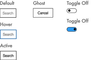
Atoms
Colours
#0F69B5
#0D5EA2
#E5182C
#0F69B5
#0D5EA2
#E5182C
#000000
#262626
#6B6B6B
#F2F2F2
#FFFFFF
Typography


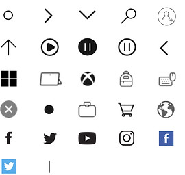
Icons

Molecules


2.0 Research
Now that the brand identity has been established, I can focus on business efficiency and user pain points, as I can not improve the website unless the user pain points are identified.
2.1 Understand target audience
Using reviews, online reports, and resources, I can learn about the target audience, industry trends, and best practises to help guide my primary research.
Reviews

Best UX Practices

Website UX Trends

2.2 Usability Testing
Now, I can collect new data that is relevant to the research objectives and engage with the target audience to gain insights and feedback.
Goals


Identify
Determine any usability issues that users may encounter while using the website.
Evaluate
Examine how simple it is for users to complete tasks and whether the design corresponds to their needs and preferences.
Iterate
Specific use pain points and opportunities be identified considered for making iterative design changes.
Tasks
Participants will be asked to navigate the website and understand what it is telling them, but there are some specific tasks I thought would be useful to gain insight into because secondary research reviews have mentioned such areas of concern.
-
Locate a help service, such as a phone number or live chat.
-
Find the laptops and try to buy one.
-
Return to the store and purchase another laptop.
-
Change your profile photo by accessing your account settings.
Methodology
All participants were told to vocalise what they feel when exploring the website.
Since the top three age groups of Microsoft.com users are agd 18- 44, all participants are also aged between there.
Post-test briefing will be conducted after the session
4 Tasks
To be performed by all participants
Task Completion Rate

Post-Session Briefing

Overall User Behaviour
Almost all users had difficulty locating the chat service, but Participant 4 was successful after noticing a chat pop up in the bottom right corner. When looking for laptops, 3/4 of the participants went straight to the "All Microsoft" tab and clicked on "computers," where no laptops or computers were found. All participants thought the website was out of date and disliked the blue links. When looking for computers/laptops, one participant clicked on "Monitors" and was taken to a screen with no content.
2.3 Competitor Analysis

To gain a better understanding of the users, I visited the Apple website, one of Microsoft's main competitors with a strong UX reputation.
This will aid in identifying areas for innovation in my design for the Microsoft website.


2.4 UX Audit
I can conduct a UX audit of the current website using the insights from sections 2.1 - 2.4 to evaluate its usability, accessibility, visual design, and overall user experience based on user needs and business goals.
Home Page
Findings
Home Page with Navigation

Search bar

Window page toggle
ALL MICROSOFT MENU

Home Page Categories and Tiles


1.0 - ICONS
Icons are not in line and are spaced differently on each side, creating an unclean appearance.
1.1 - ALL MICROSOFT MENU
The words "All Microsoft" would imply that it will show everything Microsoft has to offer, but there are many key products/services that are not on this menu. Laptops, deals, and game consoles are examples of such items.
1.2 - SEARCH
Having one cancel button and one as an icon is inconsiste. It is lacking in cohesion and professionalism.
1.3 - TILE INFO
There is a lot of text here, which makes it difficult to read, and it is even more difficult because it is a slideshow.
1.4 - LINK TO ALL DEALS
This link would appear to lead to a page with all of the deals related to the Surface Pro 9, but it is very broad and consists of all of the deals Microsoft is offering, which did not appear clear and was unexpected.
1.5 - SLIDESHOW
Even though there is a play and pause button, a slideshow of two advertisements appears unnecessary, especially since it may be an accessibility issue for some users. On a different page, however, there is an animation toggle bar instead. This is perplexing because I expected another play and puase button beneath the tile.
1.6 - VIEW SITEMAP
Because a user expects to see the sitemap when they click on that tab in the first place, having another link to the sitemap appears unnecessary and requires an extra click. It is also not very visible, so many users will miss it.
1.7 - ICONS AND BLUE LINKS
The icons appear to be too small to be effective, and their colours and sizes are inconsistent. Blue links are outdated, and there are more effective and user-friendly ways to create such links/buttons. Some of these links have excessive text, making it difficult to read and navigate seamlessly.
1.8 - SURFACE LAPTOP 5 TILE
The first slide was advertised at the top of the page, but the second slide was not. It would be a better use of space if this advertisement appeared only once on this page.
1.9- TILES
As previously stated (1.2), too much text makes it difficult for users to process information, and because these tiles are smaller, it is a good idea to have clear and minimal imagery but the text should also be minimal for that to be effective.
1.10 - FOR BUSINESS
This is an important section, especially given that the majority of visitors come for Microsoft Teams; therefore, it should be promoted earlier on the page.
1.11 - INCONSISTENCY
The icons, as well as the overall format and layout of the footer on the homepage and on the "windows" page, differ significantly. there is a mix of hard and rounded corners used throughout the pages, which makes the brand identity harder to understand.
1.12 - FOOTER
Traditional footers have contact information and Microsoft is a website where users struggle with the customer service. Hence, the current footer it makes it even harder to receive support as there is no information.
1.13 - LOCATION
This is an important feature, however it is not very clear and should be at the top of the website to prevent frustration for the user when purchasing items that may not be available to them.
Recommendations

2.5 Business Analytics
“Our mission is to empower every person and every organisation on the planet to achieve more.”
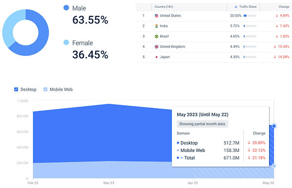
According to the Microsoft website, they cater to a wide range of audiences, including people of various ages and interests. After analysing the website's analytics, it was determined that the target audience is primarily male, with statistics of 63.55% male and 36.35% female. The desktop version of the website is used by 77.02% of their audience rather than the app, but it has seen a 10.57% decrease in visitors since last month. According to Similarweb, the majority of Microsoft.com search traffic comes from 7.1 million visitors interested in Microsoft teams. Looking at the company's age distribution, it is clear that Microsft.com appeals to people of all ages, with more than half of their audience being between the ages of 18 and 24, and nearly a quarter being between the ages of 33 and 44.
Key Insights
-
Search traffic of 7.1M visitors come with interest of Microsoft Teams
-
Targets people of different ages and interests
3.0 Ideate
Creating a mood board, Crazy 8's, and wireframing are all techniques that can be used to generate design ideas.
3.1 Moodboard
This assisted in capturing website designs that I discovered to be implementing the previously mentioned UX practises as well as the 2023 trends.

3.2 Crazy 8's
This is an ideation technique that I thought would be useful for this project because it will help me come up with innovative ideas quickly. I chose to apply this technique to design the landing page. In 8 minutes, I designed the landing page in eight different new ways.

Now we have several ideas and I can select the most effective solutions to help me with my wireframes.
3.3 Wireframing
Now I can create a skeletal framework of the home page.

4.0 Final Design
4.1 Design System
Atoms
Colours
#00A4EE
#464DB6
#795DA9
#1CA5DF
#107C10
#0178D6
#F25022
#FFB900
#7FBA00
#000000
#1E1E1E
#2B2B2B
##404040
#737373
#FFFFFF
Typography

Icons


Molecules


4.2 User Interface Design
Using my wireframes and the design system, I designed the home page UI screen

Key Solutions
-
Home page is now more cohesive and informative with minimal text.
-
Softer rounded edges that are more on trend yet still encompass the brand image as the logo and even their products have slightly rounded edges or are not rounded at all.
-
More user friendly, informative and easy to navigate with sitemap available at footer.
-
Larger icons for accessibility
-
Location setting now available at the top of the page
-
Support information in the footer
-
More informative and effective tiles with images of good context
5.0 Reflection
Throughout this project, I found it challenging to find companies that provide the same services of selling products and software, so the main competitor was Apple. Even though Apple is a well-known competitor with an image of having a user friendly website, it would have been useful to study other websites also as Apple is designed around the brand image which is very different to Microsoft's hard edges approach. Since Apple has rounded edges it is easier to be more user friendly with the trends and I found it challenging to implement these rends to the Microsoft website, while also maintaining the brand image.
Creating more pages and testing a prototype of the website would be beneficial in determining whether the solutions are adequate to the problem statement. Because the website does not yet exist, one way to test the design is to analyse the target audience and select a user group to gather feedback. If each member was asked questions about the design, honest feedback could be used to determine whether or not the idea will be successful. Following testing, any improvements can be made and tested again.