Deliveroo -
App Redesign
UI/UX, iOS, Research
Redesign the app's main pages to address the usability pain points.

Project Overview
Deliveroo is a British online food delivery service which enables users to order food from restaurants in close proximity. In this case study we will be looking at the iOS app to discover why its UX performance needs improvement.
Roles
UX Designer, UI Designer, Researcher
Design Process

Ideate
-
Reflection
1.0 Understanding Requirements

1.1 Problem Statement
Deliveroo users are experiencing difficulty in navigating the app, customising orders and cluttered unnecessary information makes it confusing. This is resulting in negative reviews and decreased customer retention.
1.2 Objectives
-
Provide innovative solutions to simplify the layout of the app, hence making it easier to navigate.
-
Address pain points in the user journey to reduce the chances of losing customers.
-
Reduce clutter and unimportant information to make it more intuitive and user friendly.
2.0 Empathise

2.1 Competitor Analysis
To further understand the users, I observed and analysed competitors and focused on the features they were offering their users.
Competitors
Just Eat and Uber Eats are other apps/websites which offer a food delivery service. Deliveroo is rated 4.6 on the app store, whereas Uber Eats and Just Eat are rated 4.7 and 4.8.
%201.jpg)
2.2 Secondary Research
I relied on reviews to gather information of the common issues most users face. The most common negative reviews were regarding the actual delivery and after delivery. After further evaluating the app and the reviews the following aspects require attention :
The most common negative reviews were regarding the actual delivery and after delivery.After further evaluating the app and the reviews the following aspects require attention :
-
Contact restaurant and driver option
-
See location of the restaurant
-
Need “Recent Searches” option
-
Customisable meals
-
Difficulty in editing basket
3.0 Define
To comprehend the user's journey when ordering through the Deliveroo service, a journey map was created.

4.0 Ideate
This promotes creativity and encourages potential solutions. HMW questions will assist in the exploration of ideas alongside wireframes, which will aid in the targeting of specific design solutions.
4.1 HMW
Implementing How-Might-We (HMW) statements to allow us to take the data and transform it is an effective way.

4.2 Wireframing
Now I can create a skeletal framework of the app.


5.0 Design
Using my wireframes I designed the UI screens to provide the solutions to the pain points identified
Experience 1 - Search
"Recent Searches" are now added as the current screens does not allow you to go back to the restaurant you just viewed.
"Top Searches" makes searching for services easier and makes the search feature mor
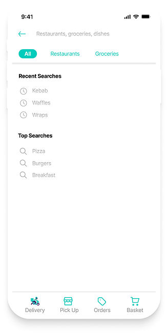
The current app does not have a navigation bar, hence the new design has included one to allow users to navigate through the app effortlessly.
Experience 2 - Restaurant
For the convenience of the user, a cleaner and more functional design has been incorporated into this new layout.
Users can see reviews for more information
Unlike the current design, in this screen the user can change whether they would like to order for delivery or pick with just 1-click
%201.jpg)
The address is now clearly visible in the new layout, and a button has been added to allow the user to call the restaurant directly.
The price for the items are more visible and images are also provided so users know what to expect.
A new section has been added where the user can directly go to their orders and see/edit their basket.
Experience 3 - Place an order
A simple addition has been made where the address can be checked and changed if necessary.
There is now an option to customise item

"Special Requests" has been added to allow users more control over their order
Experience 4 - Contact driver
%201.jpg)
The current app includes a "contact" driver button that allows you to chat or call the driver; in the new design, these options, as well as restaurant contact information, are readily available.
Experience 5 - After delivery
A timer is incorporated to allow the consumer to contact the driver within 5 minutes of delivery; thus, allowing customers to speak directly to someone when experiencing problems after delivery has been made.
%201.jpg)
A "see reviews" button has been added, as seen in experience 2. The new design includes a feature where you can leave a written review after the delivery is made, along with photo evidence if necessary.


5.1 Reflection
Overall, I am pleased with my first UX/UI project, which also taught me how to use Figma. I understand that in order to offer a successful solution, the problem must first be precisely identified. I was unable to test the portfolio because I was missing some primary research. It would be beneficial to monitor and understand user eyeball experience and which performs better, the website or the app, in order to determine where the app may be lacking. In the future, I hope to be able to expand my user research to such depths and analyse similar behaviour in my case studies.